Vanilla Toolkit Docs
Documentation for the Vanilla Toolkit template
Project maintained by renierr Hosted on GitHub Pages — Theme by mattgraham
Vanilla Toolkit
Minimalistic, lightning-fast tool collection
Vite + TypeScript + Tailwind – no React, no framework
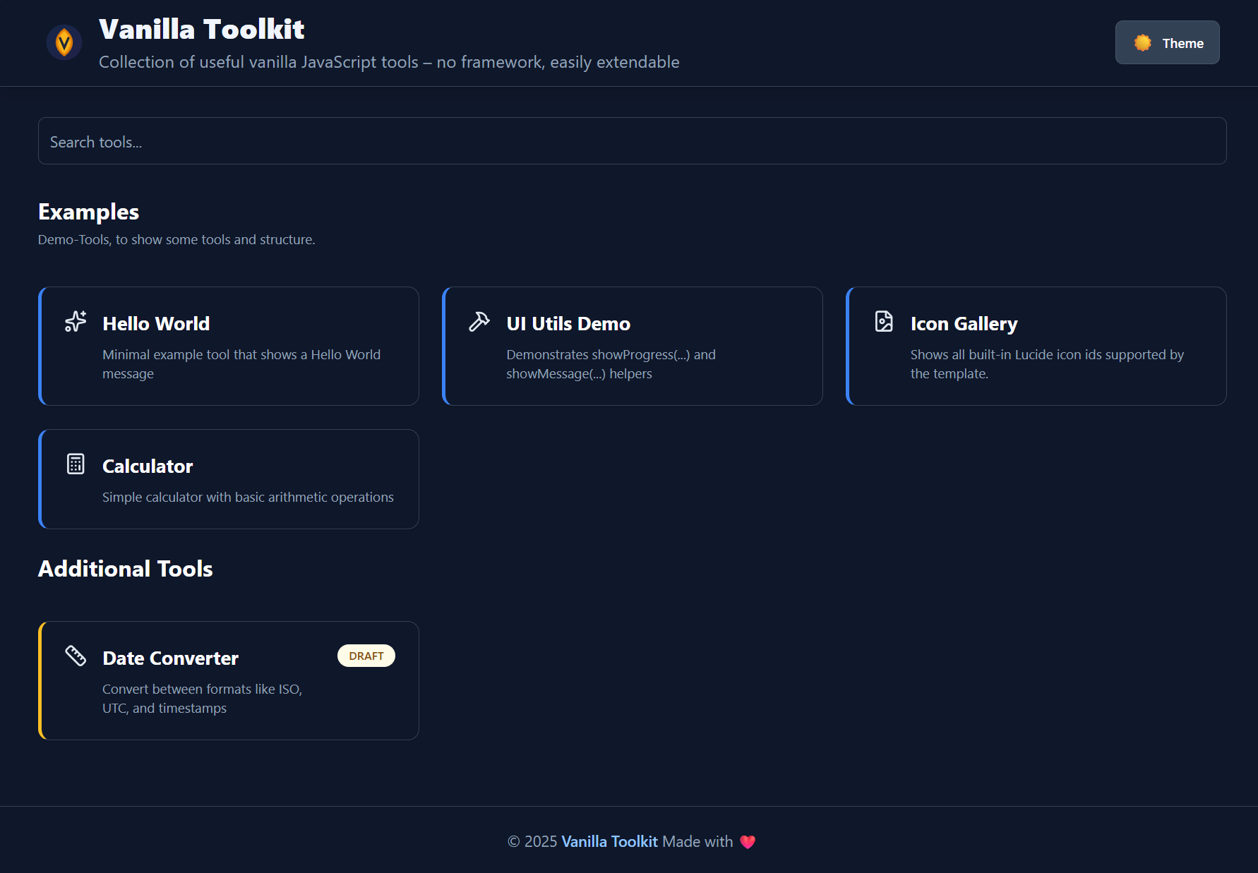
Features
- Add new tools via folder → appear automatically
- Search function with live filter
- Unified design with header & footer
- 100% offline-capable
Create a new tool (30 seconds)
Create a folder inside src/tools/.
The folder name becomes the tool’s path/URL slug.
src/tools/my-tool/
├── config.json     # Name + description + configuration
├── template.html   # Your layout
└── index.ts        # Your logic (optional)
1) Add config.json
Minimal example:
{
  "name": "My Tool",
  "description": "Does something useful",
  "draft": false,
  "example": false
}
Notes:
nameanddescriptionare shown on the overview page and used for search.draft: truehides the tool from the normal overview (useful while you’re still building it).example: trueis intended for template/demo tools (you can ignore it in real projects).
Optional fields you can add later:
icon: an icon id (see Tool Icons (Lucide) below)order/sectionId: for sorting & grouping (see next section)
2) Add template.html
This is the tool’s UI. Keep it small and composable (cards, inputs, buttons).
- Prefer semantic HTML (
label,input,button)—it improves accessibility quickly. - Prefer using daisyUI component classes together with Tailwind utility classes for consistent UI patterns.
- Avoid heavy use of Tailwind’s
dark:prefix — prefer daisyUI themes or CSS variables for theme-aware styling (examples below).
Practical tips:
- Give your tool a single root container so it’s easy to render/replace.
- Prefer semantic HTML (
label,input,button)—it improves accessibility quickly.
3) Add behavior in index.ts (optional)
If your tool is interactive, put the logic in index.ts.
Typical responsibilities:
- Wire up event listeners (click, input, submit)
- Read/write values from the DOM
- Implement the actual tool logic (formatting, conversions, generators, etc.)
Keep it defensive:
- Validate user input before processing
- Handle empty states (e.g. “nothing entered yet”)
- Avoid throwing on malformed input—show a message instead
Export style
Your tool entry can be exported either as a default export or as a named init export:
// Default export
export default function init() {
  // ...
}

// Named export
export function init() {
  // ...
}
Important: cleanup when navigating between tools
Tools can be opened/closed via routing, so your index.ts may run multiple times.
If you attach any global listeners (e.g. document.addEventListener, window.addEventListener), timers (setInterval), observers, etc.,
make sure you return a cleanup function that removes them.
export default function init() {
    const onKeyDown = (e: KeyboardEvent) => {
        // ...
    };
    document.addEventListener('keydown', onKeyDown);

    // Return cleanup to prevent duplicate listeners when navigating away/back
    return () => {
        document.removeEventListener('keydown', onKeyDown);
    };
}
Rule of thumb:
- Listeners on elements that get replaced with the tool DOM are usually fine.
- Anything attached to
document/windowshould be cleaned up.
4) Run it
Start the dev server and open the app:
pnpm run dev
Your tool should appear automatically on the overview page. If it doesn’t:
- Check that the folder is directly under
src/tools/<tool-name>/ - Ensure
config.jsonis valid JSON (no trailing commas) - Restart the dev server after renaming folders/files
Common patterns (quick checklist)
- Hide until ready: set
"draft": true - Make it discoverable: write a clear
description(it powers search) - Keep it stable: don’t rename the folder unless you’re okay with the URL changing
Tool-specific dependencies (pnpm-workspace.yaml)
Each tool can declare its own dependencies by adding a package.json inside its folder.
This is supported by the project’s pnpm-workspace.yaml setup.
Example:
The tool example-package in this project add its own dependencies:
(demo purpose only with a lightweight dependency)
// src/tools/example-package/package.json
{
  "name": "example-package",
  "version": "1.0.0",
  "dependencies": {
    "is-odd": "3.0.1"
  }
}
- Run pnpm install at the project root to install all tool dependencies.
- Each tool’s dependencies are isolated and won’t affect others.
Note: This allows tools to use different libraries or versions as needed, without polluting the main project dependencies.
Optional: src/main.ts (custom startup invocation)
In addition to per-tool scripts, you can add an optional project-level entry hook: src/main.ts.
If the file exists, it will be auto-imported and executed once on startup — before the initial route (overview/tool) is rendered.
This is useful for global, one-time setup such as:
- registering additional / overriding icons
- adding global event listeners
- initializing app-wide utilities
- debugging/logging (e.g. number of loaded tools)
Export shape
You can provide either a default export or a named init export. Both may be async:
// src/main.ts
import type { CustomMainContext } from './js/types';

export default function main(ctx: CustomMainContext) {
    console.log('Loaded tools:', ctx.tools.length);
    // global setup...
}

// alternatively:
export function init(ctx: CustomMainContext) {
    // ...
}
Context (ctx)
Currently, the context contains the already-discovered tool list:
ctx.tools: all tools (including metadata), as used later for overview + routing.
Important note about side effects
This main.ts invocation is a one-time hook (not a routing lifecycle).
If you register global side effects here
(e.g. window.addEventListener, timers, observers),
you are responsible for managing cleanup yourself — unlike tool index.ts,
which can return a cleanup function.
Ordering & Section grouping (Overview page)
Tools can be sorted and grouped into sections on the overview page by adding two optional fields to a tool’s config.json:
order(number): controls the position within a section (ascending)sectionId(string): groups tools into a named section
Example config.json
{
  "name": "My Tool",
  "description": "Does something useful",
  "draft": false,
  "example": false,
  "sectionId": "examples",
  "order": 1
}
How sorting works
- Tools are sorted by:
order(ascending)name(A → Z) as a tie-breaker
This means you can keep the list stable and intentional, even when multiple tools share the same order.
How sections work
- Tools with the same
sectionIdare rendered under the same section header. - Section header text (title + optional description) is configured in the site config (see below).
- If a tool has a
sectionIdthat is not configured, the UI falls back to showing the rawsectionIdas the section title. - If a tool has no
sectionId, it is grouped into a default “other” section.
Configure section titles via SiteConfig
Section titles and descriptions live in the site configuration.
- Copy the template config:
src/config/site.config.template.ts→src/config/site.config.ts
- Define your sections (keys are the
sectionIds):
export const siteConfig = {
  // ...
  toolSections: {
      examples: { title: 'Examples', description: 'Demo tools that show how the template works.', },
      general: { title: 'General', description: 'Everyday helpers and utilities.', },
  },
};
Section order:
Sections are rendered in the insertion order of toolSections first, followed by any additional sections discovered at runtime.
Site configuration override
The default configuration lives in src/config/site.config.template.ts.
To customize the configuration for your project, copy the file to the Name site.config.ts and change any configuration values.
See types in src/config/site.config.ts for possible values.
Tool Icons (Lucide)
Each tool can optionally define an icon in its config.json.
Use the icon id syntax from lucide (lower case with dashes)
If icon is missing or unknown, a default icon is used.
Available icon ids
per default all lucide icons are included.
You can add additional icons registering them at startup (see src/main.ts).
Register custom icons (derived projects)
This template exposes an icon registry so derived projects can add (or override) icon IDs without editing src/js/tool-icons.ts.
1) Import registerToolIcons in your entry file (e.g. src/script.ts).
2) Import any additional icons you want from lucide or any other source follwing the syntax.
3) Register them at once during startup (see main.ts hook above).
import { registerToolIcons } from
        './src/js/tool-icons';
import { ArrowLeft } from '@lucide/icons';

registerToolIcons({
    ArrowLeft: ArrowLeft,
    // add more icons here
});
Now you can reference your new icon IDs from any tool config.json:
{
  "name": "My Tool",
  "description": "Does something useful",
  "icon": "arrow-left"
}
Notes:
- If an ID is unknown, the renderer falls back to a default icon.
- If you register an existing ID, it will override the built-in icon for that ID.
Template Placeholders
Brief and practical:
- Syntax: Use
{{ key.path }}inside your HTML templates, e.g.{{ config.title }}. - When they are replaced: Placeholders are replaced by the central function
replacePlaceholders()(seesrc/js/utils.ts). In this codebase the header and footer templates are processed before being inserted into the DOM (src/js/render.ts). - Where the values come from: Values are read from the exported
siteContextinsrc/config/index.ts.siteContextmerges the defaults fromsite.config.template.tswith an optionalsrc/config/site.config.tsfile. - How it works:
replacePlaceholders()uses the regex/\{\{(.+?)\}\}/g, trims the path and resolves the value using dot-notation withgetValueByDotNotation(). - Missing values: If a placeholder cannot be resolved, a console warning is emitted and the placeholder is replaced with a visible marker such as
[{{...} NOT FOUND]to make the issue obvious.
Example (Template → Result):
<!-- Template -->
<h1>{{ config.title }}</h1>

<!-- After replacement -->
<h1>Vanilla Toolkit</h1>
Dark/Light Mode
This project works with Tailwind’s class strategy but also supports daisyUI’s theme system. In practice prefer daisyUI theme tokens and components instead of sprinkling many dark: utilities across your templates.
Why prefer daisyUI tokens?
- daisyUI exposes semantic tokens (e.g.
bg-base-100,text-base-content,border-base-300) that automatically adapt to the active theme. - You get ready-made components (
btn,card,input,form-control, etc.) and consistent spacing/colors with minimal classes. - Theme switching is handled via the
data-themeattribute on<html>(ordocument.documentElement), which is simpler than toggling manydark:variants.
Quick daisyUI examples (concise):
<!-- Card -->
<div class="card bg-base-100 shadow-md p-4">
  <h3 class="text-lg font-semibold">Card title</h3>
  <p class="text-sm text-base-content/70">Card content</p>
</div>

<!-- Button -->
<button class="btn btn-primary">Save</button>

<!-- Input -->
<div class="form-control">
  <label class="label"><span class="label-text">Name</span></label>
  <input class="input input-bordered" type="text" />
</div>
Theme-aware tokens (preferred replacements for common pairs):
- Use
bg-base-100instead ofbg-white/dark:bg-slate-800. - Use
text-base-contentinstead oftext-gray-900/dark:text-white. - Use
border-base-300instead ofborder-gray-200/dark:border-slate-700. - Use
btn,btn-primary,btn-outlinefor buttons instead of crafting many color utilities.
Toggling theme (simple script):
// set theme to 'dark' or 'light' (or any daisyUI theme name)
document.documentElement.setAttribute('data-theme', 'dark');
// read current theme
const theme = document.documentElement.getAttribute('data-theme');
When to still use dark:
- For very small, local overrides where a single property needs a different value in dark mode.
- For legacy templates that already rely on
dark:variants and where migration isn’t worth the effort.
Rule of thumb:
- Prefer daisyUI tokens and components for most UI work.
- Use
dark:sparingly for edge-case, one-off style changes.
Focus & Hover States with daisyUI
Most components include sensible focus/hover styles. If you need custom behavior, combine tokens with Tailwind utilities:
<input class="input input-bordered focus:ring-2 focus:ring-primary/60" aria-label="Example input" />
<button class="btn btn-primary hover:brightness-90">Action</button>
Custom styles
Add your own custom styles to src/css/styles.css below the marker comment to avoid conflicts with the template styles on merge.
Extending SiteContext (derived projects)
This template is meant to be cloned (GitHub template). To allow project-specific context fields without modifying the core template types, SiteContext exposes a TypeScript declaration merging extension point.
What you can extend
SiteContext automatically includes everything you add to the global interface SiteContextCustom.
How to use it in your cloned project
1) Create a declaration file (any name is fine), for example:
src/site-context.custom.d.ts
2) Add your custom fields by extending SiteContextCustom:
declare global {
    interface SiteContextCustom {
        custom?: { foo: string; bar?: number; };
    }
}
export {};
After this, your SiteContext type will include custom, features, etc. everywhere it’s used.
You can now use it in your tool configs and templates.
Notes / troubleshooting
- Make sure TypeScript includes the file. Your
tsconfig.jsonshould include something likesrc/**/*.d.ts(orsrc/**). - To avoid naming collisions, consider grouping your additions under a single top-level key (e.g.
custom).
Keeping Derived Projects Up-to-Date (Template Sync Workflow)
This template supports automatic updates for derived repositories using a GitHub Actions workflow.
The workflow uses AndreasAugustin/actions-template-sync
to regularly or manually sync changes from the template repository into your project.
Workflow Setup
The synchronization uses the existing workflow file .github/workflows/template-sync.yml.
This workflow is configured to run automatically at 00:00 UTC on the first day of every month (cron: '0 0 1 * *').
You can also trigger it manually at any time via the GitHub Actions UI.
How it works
- The workflow checks for updates in the template repository.
- If changes are found, it creates a pull request in your derived repository with the updates.
- You can review and merge the pull request to apply the changes.
Ignoring files during sync
To prevent certain files or folders from being overwritten, a .templatesyncignore exist in the .github directory.
Use glob patterns to specify files to ignore.
And above all, have fun with this template! 😊